34
$\begingroup$

I'm working on a map of several star systems (with the stars, planets, etc. not to scale with the map), and I'd like to show that they don't all lie in the same plane. Some orbits are perpendicular to the plane of the viewer, while others are flat, and still others are at odd angles.

In short, I'd like to show three dimensions of celestial motions on a two dimensional map, without trying to simulate three dimensions by showing the entire setup from some angle. This needs to be viewed only from the top down.

How can I do this?

$\endgroup$
13
  • 2
    $\begingroup$ Seeing the new answers pop up, I think it may be best to clarify what you mean by without using art. (I'd actually considered all 3 alternate suggestions - height lines, vectors, and altitude color but I deemed them "art" and didn't include them to my answer). $\endgroup$
    – Aify
    Commented Jun 8, 2015 at 18:12
  • 3
    $\begingroup$ "This needs to be viewed only from the top down" - well there's your problem right there. "Top" and "down" and other directions have absolutely no meaning in space. It's also the beginnings of a solution: have multiple maps with multiple "tops" and "downs". $\endgroup$
    – evankh
    Commented Jun 8, 2015 at 19:35
  • 3
    $\begingroup$ One word: Holograms. ;) $\endgroup$
    – Ayelis
    Commented Jun 8, 2015 at 20:09
  • 3
    $\begingroup$ "without [...] showing the entire setup from some angle. This needs to be viewed only from the top down." How is top-down not an angle? Or in other words, how do you expect to be able to intuitively convey depth without perspective? $\endgroup$ Commented Jun 9, 2015 at 2:24
  • 2
    $\begingroup$ Technically however the map is drawn it will be from some angle. If the map is already top-down, that is viewing the planets from an angle. In order to project a 4-dimensional system (planets do move, so I'm counting time as a dimension) onto a 2-dimensional piece of paper requires some form of projection (from an angle, including top down). There is no way to do this without some form of annotation or wihtout producing multiple maps. $\endgroup$
    – Pharap
    Commented Jun 9, 2015 at 4:45

11 Answers 11

24
$\begingroup$

[This answer has been invalidated by a clarification of the question, but is included here for reference purposes.]

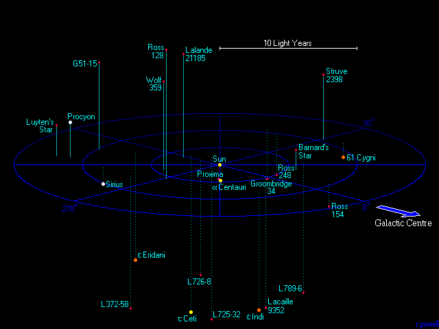
Use height lines.

To indicate if the item is above or below the galactic plane (or other reference plane), you might use different line styles (as below with dotted vs solid lines)...

solid lines indicate higher z-axis, while dotted lines indicates a lower z-axis

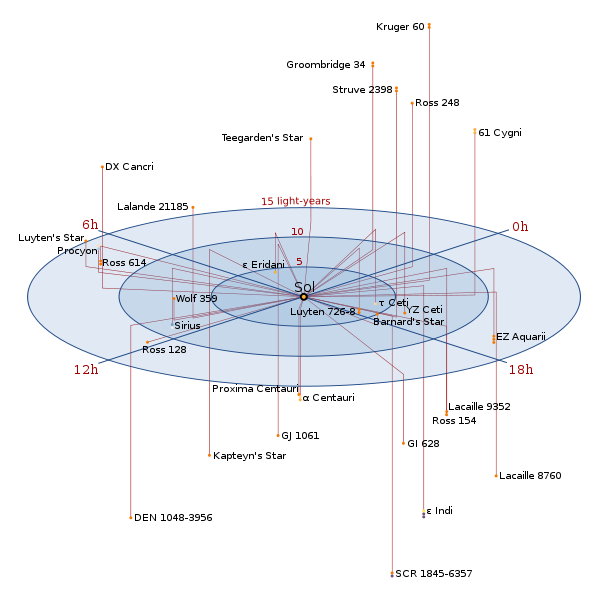
...or you could use lines that radiate from a center point.

lines emanate from the origin point, outward to the correct x/y-position, and then up or down to the proper z-position.

I've also seen height-lines that emanate from a dash(or common symbol) on the center plane leading to the star/galaxy in question, but I cannot find a graphic for this at the moment. It may be enough that there's a star at one end of the line, and none at the other end, as long as the lines don't overlap other lines leading to other stars (which could be confusing!)

$\endgroup$
8
  • $\begingroup$ I thought of this, but I didn't want to try to simulate three dimensions. $\endgroup$
    – HDE 226868
    Commented Jun 8, 2015 at 18:12
  • 1
    $\begingroup$ Ah, so perhaps something more like this? Though I'm not sure how you would indicate which items were more close... perhaps by changing the thickness/boldness of the orbit lines? $\endgroup$
    – Ayelis
    Commented Jun 8, 2015 at 18:23
  • 1
    $\begingroup$ After thinking about it, I came up with... something exactly like a cross between Samuel's answer and Aify's answer. Good work, guys! $\endgroup$
    – Ayelis
    Commented Jun 8, 2015 at 20:06
  • 1
    $\begingroup$ You know what? I like this. My requirement still stands, but I might be willing to change that. $\endgroup$
    – HDE 226868
    Commented Jun 8, 2015 at 20:12
  • 1
    $\begingroup$ This is one of the techniques used by Elite: Dangerous. $\endgroup$
    – Pharap
    Commented Mar 21, 2017 at 21:49
17
$\begingroup$

Apply a z-axis number to each star/planet/asteroid etc.

This works because maps (typically) represent stationary (or mostly stationary) objects. Even though the stars move and things orbit, those are predictable paths that we can represent using various ellipses.

For example, imagine the average world map we have. Mountains just look like big circles. Now imagine a bunch of dots on in space, representing stars, planets, etc. Each one of those also has a number beside it, negative and positive numbers included. A "0" represents the very center of your dimension. Higher numbers represent "closer" to the top of the dimension (closer to the top of the imaginary box), and negative numbers represent the lower regions (bottom of the box).

if your map includes the orbits of these stars and planets, you may want to draw a dotted line along those orbits, and place more z-dots along those orbits to show the different angles of orbit.

$\endgroup$
11
  • $\begingroup$ The thing is, the numbers are rather large. I could use larger units, like light-years, but I need some smaller numbers, too. Writing "0.000006789 light-years" wouldn't be too good. $\endgroup$
    – HDE 226868
    Commented Jun 8, 2015 at 17:55
  • 2
    $\begingroup$ E notation :P @HDE226868 It also kinda really depends on the amount of detail compared to the size of the map (which is a limitation of any map) - but the only solution to that is to make either the map larger or to make more smaller detailed maps that patch together... $\endgroup$
    – Aify
    Commented Jun 8, 2015 at 17:55
  • $\begingroup$ Duh. You're right. I was trying to communicate that the number of non-zero digits would be longer, though. $\endgroup$
    – HDE 226868
    Commented Jun 8, 2015 at 17:56
  • $\begingroup$ @HDE226868 Rounding comes in useful, and since celestial bodies are always moving anyways, you can never really have a fully accurate star map. Perhaps doing something like "~1.3e^14" is better than "1.33223443" $\endgroup$
    – Aify
    Commented Jun 8, 2015 at 17:58
  • $\begingroup$ That's true, right. $\endgroup$
    – HDE 226868
    Commented Jun 8, 2015 at 17:59
14
$\begingroup$

Do it digitally.

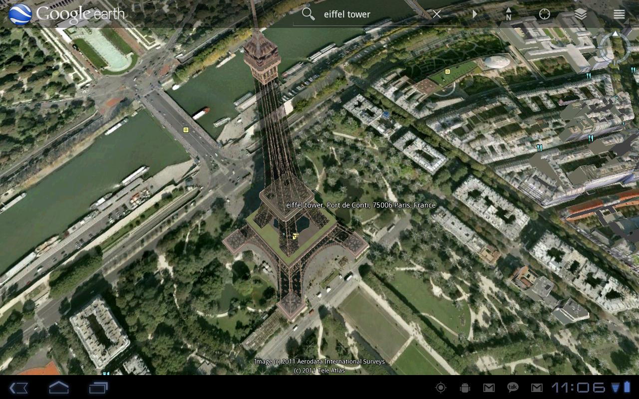
A screen is still 2-dimensional, no? However, a screen allows you to add functions such as rotating the map - a tried-and-tested method of showing 3D. See Google Earth for an example:

enter image description here

You can also combine this with the other answers here to come up with a method of showing position, movement, and giving a visual cue to it all.

$\endgroup$
4
  • 4
    $\begingroup$ +1 I came to post the same thing. The only good way to make a map of 3D space actually usable is to make it interactive. Who in their right mind would print a map of the galaxy on paper? $\endgroup$ Commented Jun 9, 2015 at 6:08
  • 3
    $\begingroup$ Not to mention that if you have the technology for intergalactic travel, you probably also have the tech for interactive 3D maps. $\endgroup$
    – Ajedi32
    Commented Jun 9, 2015 at 13:45
  • $\begingroup$ Nevermind, I'm performing the cleanup. $\endgroup$ Commented Jun 9, 2015 at 15:47
  • $\begingroup$ Also, wouldn't that map be enormous? $\endgroup$
    – Imperator
    Commented Mar 22, 2017 at 10:53
13
$\begingroup$

With colors.

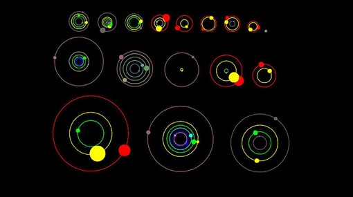
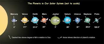
I would use solar system representations like these: enter image description here

That have orbital vectors demonstrating the orientation of the orbital plane like this:

enter image description here

For the 3D relationship you can use color depth mapping. Systems in plane are white, above plane shift to deeper blue, and below plane shift to deeper red.

$\endgroup$
8
  • $\begingroup$ How could you indicate a third dimension? I don't want to simulate three dimensions, remember. $\endgroup$
    – HDE 226868
    Commented Jun 8, 2015 at 18:12
  • $\begingroup$ I had imagined you mean not wanting to make a simulated 3D image, like this. I've updated the answer. $\endgroup$
    – Samuel
    Commented Jun 8, 2015 at 18:24
  • 2
    $\begingroup$ This has the top-down orientation right on the money, at least, and color depth mapping seems an innovative solution. Overlaying planets with their tilt alone might confuse the user as to perspective, so perhaps that information could be written also in text. I think this, appended with Aify's answer on appending z-coordinates and orbital inclinations, would be the best solution to the question. +1 $\endgroup$
    – Ayelis
    Commented Jun 8, 2015 at 20:07
  • $\begingroup$ Clever idea. +1. $\endgroup$
    – HDE 226868
    Commented Jun 8, 2015 at 20:12
  • $\begingroup$ I can't vote down but compared to other solutions that first diagram with the colours is horribly unintuitive. $\endgroup$
    – Pharap
    Commented Jun 9, 2015 at 4:09
6
$\begingroup$

Use two maps.

I was thinking about how space wargames (board, not computer) represented 3D. I recall at least one used two boards. One was horizontal and the other vertical, like a Battleship board. However, they represented the same thing. Each ship was represented by two markers, one on each board. This avoided needing to suspend playing pieces above the board. The location of a ship was above its counter on the horizontal board and in front of its counter on the vertical board.

If you really want to avoid an isometric view, two maps (XY and XZ, or whatever you prefer to designate them) would work. I think this would be clearer for star positions than planetary orbits, though.

$\endgroup$
3
  • $\begingroup$ I just realised somebody else had already given this answer. I should probably delete mine for being a duplicate. Before I do though, would you like to use the image from my answer as it helps to illustrate what you described (using the exacte same Axes ironically). $\endgroup$
    – Pharap
    Commented Jun 9, 2015 at 15:53
  • $\begingroup$ It does point out how hard it is to read - I struggle to visualize it. I'm not saying your map is bad, just that two maps are hard to read at once unless they're oriented like Battleship. I notice the blue star changes in size. Is this intentional, to reflect that it's closer to the viewer in the XZ map? I wasn't thinking of incorporating such perspective. $\endgroup$ Commented Jun 10, 2015 at 17:27
  • $\begingroup$ It changes size because I accidentally messed up the scale when creating them. They're actually orphographic renders of a 3D scene because I trust a 3D renderer to product more realistic representations than I could manage The second image was accidentally taken with persective projection I think. The problem with the Battleship idea is that the boats are aligned to a grid. Real planets aren't grid-aligned. $\endgroup$
    – Pharap
    Commented Jun 10, 2015 at 19:17
6
$\begingroup$

A data visualization project I once saw had an interesting twist. While the developer had a database with a 3D model of the relationships of various objects to each other, he was trying to display this on a 2D computer screen.

His solution was to envision the data as something like a model illuminated from behind, with the computer screen being a piece of paper between you and the model. The relationships would then be something like shadows projected on the screen, with objects "closer" to the observer being clearly defined, while objects "farther" from the observer would be much fainter or fuzzier.

Being a computer model, this also had the advantage that the model could be rotated in the "space", so relationships changed depending on where the observer was observing from. If you hold the model steady, but envision the observer moving with the paper "map" between him and the model (with the constant light source always in a straight line between the paper and the model, the relationships now represent the observer's movement through space. For you, a series of maps could represent snapshots of the voyager through space. In a story, you could have the map made of "smart" paper and being a display connected to a database of the mapped star systems.

$\endgroup$
4
$\begingroup$

First, declare a baseline. You'd probably use Earth's orbital plane, or the galactic orbital plane depending on the scale of empire you're working in.

Now include three numbers next to each star chart (one per system):

  1. Number of light years off of base. Depending on scales you would change your notation.
  2. Number of degrees of "tilt" off of base.
  3. Rotation of the tilt when compared to some arbitrary direction (center of the galaxy)?

So you might end up with a numbering like:

94*36*87

Which tells you that the system is 94 light years above the plane, is tilted 36 degrees off, and that the tilt is such that the "lowest" point of the orbits is 87 degrees off of the center of the galaxy.

$\endgroup$
3
$\begingroup$

So, Aify covered the most common analogy in the real world, the topographical map. The only other commonly used solution to this that I can think of is to use colors to represent altitude in a color-map.

Violet represents the low point of the map, and red the high point, and all distances in between are assigned a color value based on the percentage of difference. Anyone who has ever seen a rainbow already knows how to interpret this map. Some maps will use white as the high point, but let's not discuss those.

This is particularly effective in showing 3 dimensional motion as the human eye is quick to pick up on the color change of a moving object.

$\endgroup$
2
  • $\begingroup$ That's pretty much what I was going to write. However, he did mention that he was using a large range of distances. Meaning you will have a lot of different colours and they will be hard to distinguish. One way to solve it would be to use a non linear scale but it doesn't make the map easier to read? $\endgroup$
    – Vincent
    Commented Jun 8, 2015 at 19:05
  • $\begingroup$ He did say it wouldn't be to scale, so I'm thinking the distance between stars would set a system's base color, and the planets and moons would get an offset 'shade' from that. As the stars and planets would be relatively large, it should be easy to see the difference between more subtle shades. I'll see if I can create a sample gif to attach later. $\endgroup$
    – IchabodE
    Commented Jun 8, 2015 at 20:50
3
$\begingroup$

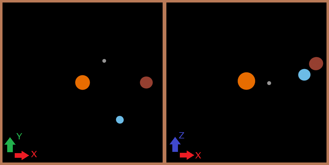
You could produce multiple maps viewing the scene from different angles, like so:

Two image map

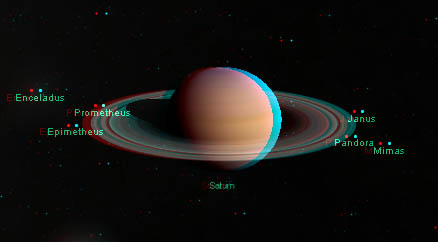
Alternatively you could make the map anaglyphic:

Anaglyphic planets

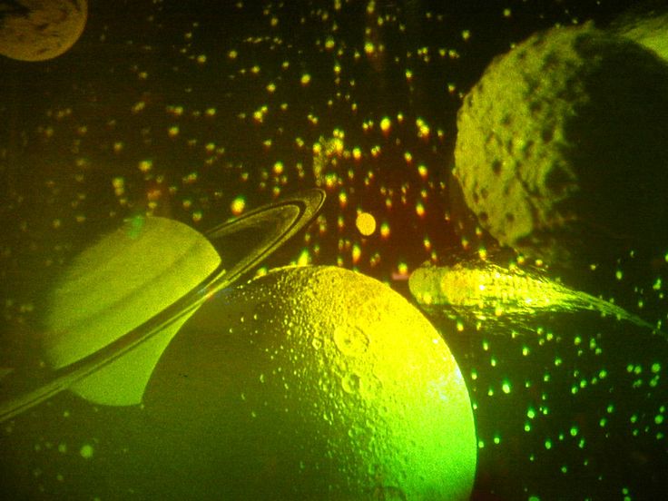
Or make it holographic:

Holographic planets

$\endgroup$
2
  • 1
    $\begingroup$ Your last image is broken. Is this image like what you had? Otherwise, you should find another image. $\endgroup$
    – Laurel
    Commented Mar 21, 2017 at 16:47
  • $\begingroup$ @Laurel Yes, it seems that domain has gone out of existance for some reason. I can't remember what image I had but that looks like it. Instead of using that exact image though, I reverse image searched to find a larger one and stuck it on my own imgur (along with the third image) to make sure none of the links die again. $\endgroup$
    – Pharap
    Commented Mar 21, 2017 at 21:46
3
$\begingroup$

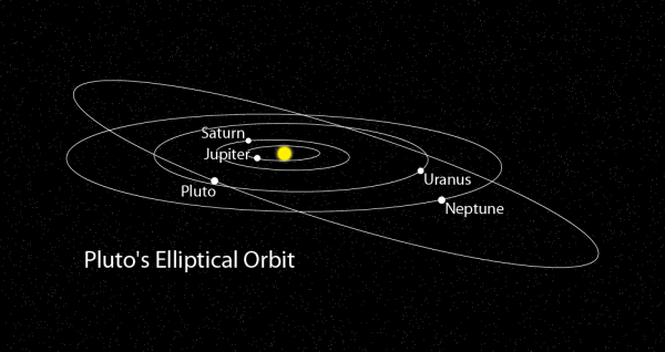
Googling the orbit of Pluto and doing an image search should give you quite a few good options.

This picture in particular pretty clearly illustrates that Pluto's orbit isn't inline with the rest of the planets... It could certainly be extended to multiple star systems. Pluto's Orbit

$\endgroup$
9
  • $\begingroup$ The thing is, the representation there messes up the orbits of the other planets, making them appear less circular. $\endgroup$
    – HDE 226868
    Commented Jun 8, 2015 at 20:18
  • 1
    $\begingroup$ @HDE226868 You can't embed a 3D space into a 2D space, so something has to go. Perspective is a time-honored way of representing 3D objects in a 2D image and is readily understood by typical audiences. $\endgroup$ Commented Jun 8, 2015 at 22:05
  • $\begingroup$ @Gilles I realized that, and that I had also messed up an assumption I made about my earlier comment. aslum, +1. $\endgroup$
    – HDE 226868
    Commented Jun 8, 2015 at 22:35
  • $\begingroup$ @HDE226868 Technically no orbit is perfectly circular. Most orbits are actually eliptical to some extent. $\endgroup$
    – Pharap
    Commented Jun 9, 2015 at 4:12
  • 1
    $\begingroup$ @Philipp I didn't say it would solve those problems, I said it would solve the ordering problem, which it would do. If each ellipse were a different colour then you'd be able to tell that Pluto passes behindg Neptune and Uranus by seeing which colour ellipse is on top at the points where they cross over. Aside from which the OP never asked to be able to see the ascending node or the ratio between inclination and argument of periapsis. The OP asked for 3 dimensions represented in 2, this diagram does that and partially represents the 4th. $\endgroup$
    – Pharap
    Commented Jun 9, 2015 at 18:33
1
$\begingroup$

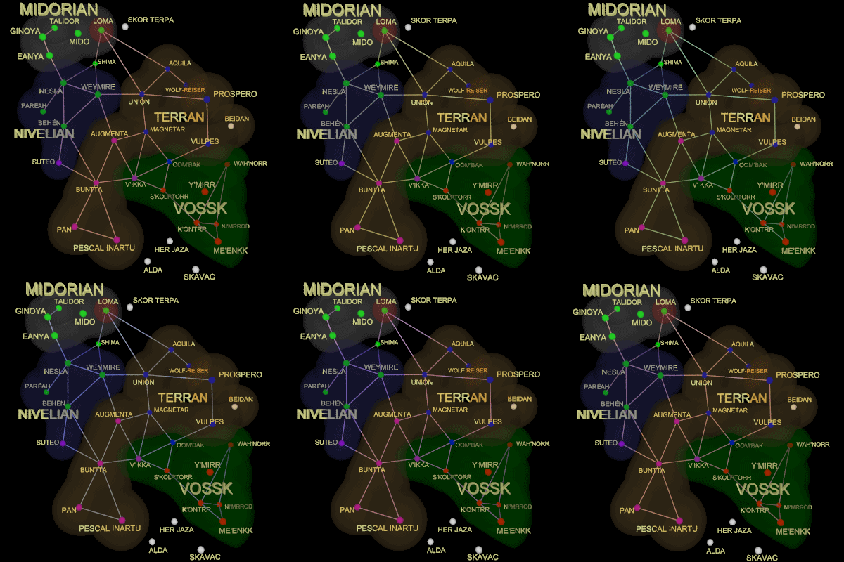
This map is an animated .GIF designed to bring out the third dimension for the Galaxy on Fire Wiki.

Shifting gif

By rotating the point of view slightly, it provides the visual cues to get depth out of a flat picture without the need for 3-D glasses.

$\endgroup$
7
  • 2
    $\begingroup$ I see no 3D effect on this image, just a flat 2D image with wobbly spheres. $\endgroup$
    – Pharap
    Commented Jun 9, 2015 at 15:57
  • 1
    $\begingroup$ @Pharap That animation appears to use too large a focal length, causing all of the stars to appear to be roughly the same distance from the viewer and therefore making it difficult to fully comprehend their different depths. You'd want to make this kind of animation with a short focal length such that the farthest star appears not to move at all, and the nearest star moves dramatically. Unfortunately, this isn't an accurate way to depict depths on a map, and doesn't satisfy the asker's requirement for a 2D map from the top down. $\endgroup$
    – talrnu
    Commented Jun 9, 2015 at 17:06
  • $\begingroup$ @talrnu If that is the graphic's intent, it might as well make a full rotation around the group of planets being mapped to use their scale to represent distance. That would be using 3D projection though, which also violates the OP's "without [...] showing the entire setup from some angle. This needs to be viewed only from the top down." rule. I think animation would probably violate the restrictions anyway. $\endgroup$
    – Pharap
    Commented Jun 9, 2015 at 18:38
  • $\begingroup$ It's VERY slight. Compare the bottom right, red stars of Me'enkk and Ni'mrrod, the latter of which is further away. Shima and Pareah in the green area also seem to be slightly further away, as does Wolf-Reiser in the blue. I imagine this map's side-on view being relatively flat with the exception of those four stars. ;) $\endgroup$
    – Ayelis
    Commented Jun 10, 2015 at 0:12
  • 2
    $\begingroup$ @Pharap Here's a fun example: moillusions.com/wp-content/uploads/i207.photobucket.com/albums/… In addition to having a better focal length, this one also animates back and forth more rapidly, so the illusion is much more effective. $\endgroup$
    – talrnu
    Commented Jun 10, 2015 at 17:32

You must log in to answer this question.

Not the answer you're looking for? Browse other questions tagged .