You can carve up a galactic disk into colonial empires like Africa, if that is the metaphor you are trying to make. It has been done again and again.

But carving a photograph into political boundaries doesn't tell us much about anything, except the relative sizes of the "empires" which we can infer to imply power and resources (although our own maps suggest this is a bad indicator of either), and which "nations" share common borders (which in a 3D world is almost nonsensical).
But the narrative message is clear: the galaxy is divided into political realms and their areas of dominance. That might be all you really need to say. In the above example, distance and geography are meaningless since the cannon of Star Trek routinely involves long wars with enemies from impossible distances, and conveniently mutable travel times between empires. It's little wonder they avoided showing maps like this, even when they would be relevant to the plot (Voyager's journey home, DS9's space world war).
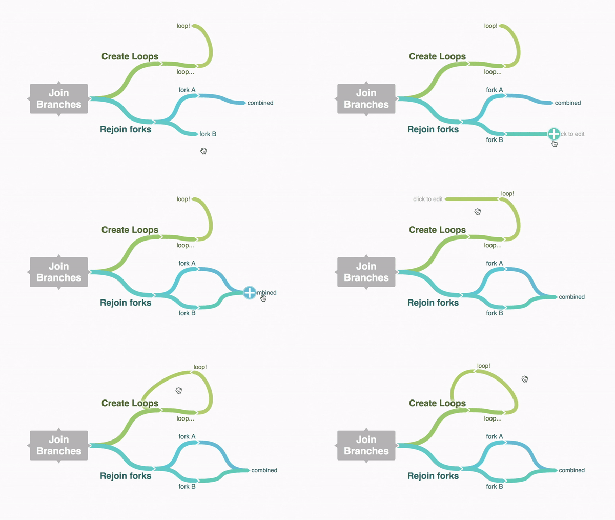
I recommend instead using mind mapping software to create your star map.

"Empires" become hub nodes with multiple satellites. Trade routes can be marked by linking the nodes and connecting the branches. Factions can be colors, power centers can be shown by node or font size. Individual stars can be tagged in multiple ways: resources, political affiliation, religion, species, etc.

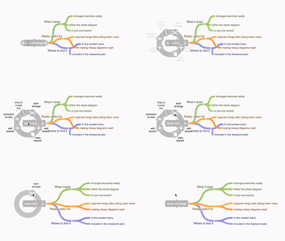
The data can be re-arranged in a single click to show a particular star's neighbors and associations. Also the data can be fill-in as needed, becoming granular only with worlds that are actually relevant. As an author or as a reader, a map that shows all the narrative connections is probably more important than one that just shows a point in space.
There's no need to draw borders because "nations" will probably exist as bubbles around planet strongholds, and alliances may have more to do with ideology or resources than nextdoor neighbors. Since there's a lot of emptiness in space, "filler" systems don't need to be placed at a geo-representative pin location. If they need to be represented at all, they can be in broad abstraction – a single node for the (uninhabitable) center of the galaxy (as a location), or a single node for "badlands" or "unaffiliated territories" explain a narrative function without bringing up more questions (like: "Why can't they just fly around it?").
The animated gifs are from a freemium mind map web service called Coggle.


