4
$\begingroup$

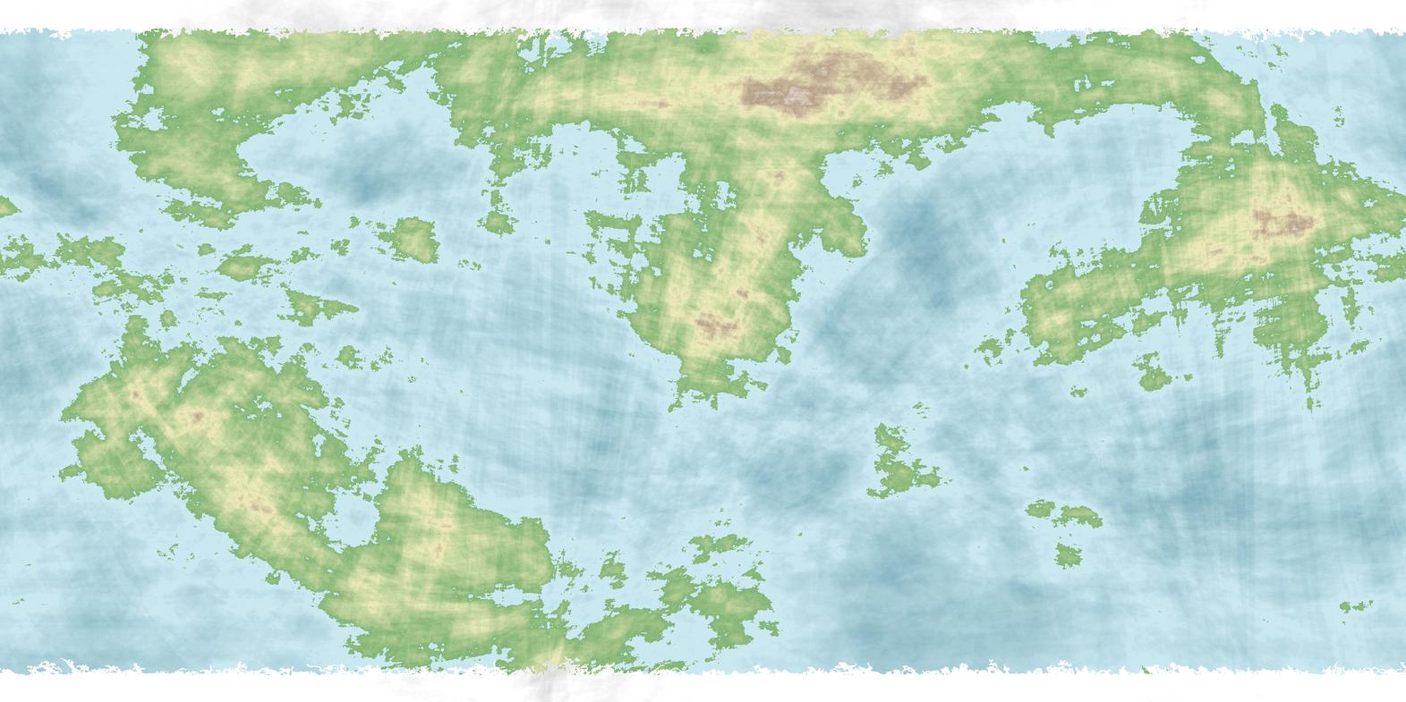
Im working on this little hobby project and i've come to the stage where i want an actual world map. So id decided to use one of the mapgens out there untill i found one i was happy with:

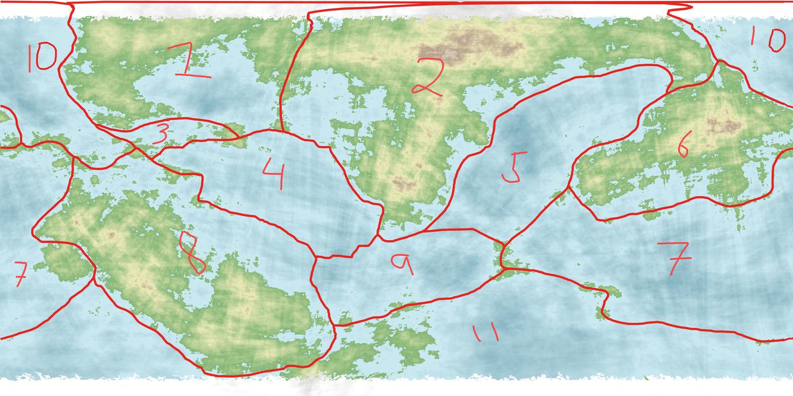
Now i have been following Artifexian among others and i thoght why not make a relative realistic map. So first task was to draw out some plates. I mapped it to GPlates (where it actually looked really nice) and came up with the following:

Now, is this reasonable placement of plates? Any tips and suggestions are welcome.

I want to mention that this is a generated map and a rough draft, i inted to keep cleaning it up as i keep working on it. I imagine there's way to many tiny island and stuff here and there, but i'll get to that eventually.

Update:

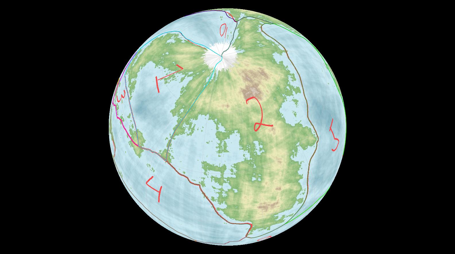
Firstly i would like to thanks for the feedback i recived thus far, it has been helpful. Now english is not my first language so i may have misinterpreted some things but so far this is what i've come up with:

The top borders looks a little wonky due to mapping, here's how the projected atlas looks:

Any further feedback is of course much appreciated.

$\endgroup$
3
  • 1
    $\begingroup$ What does each color mean? $\endgroup$
    – L.Dutch
    Commented Jan 31, 2022 at 18:06
  • $\begingroup$ Nothing special, just to mark different plates. $\endgroup$
    – Gixen
    Commented Jan 31, 2022 at 19:12
  • 2
    $\begingroup$ Without boundary type classifications, plate motion direction arrows would be sufficient to work those out by the way, this map cannot be accurately evaluated. $\endgroup$
    – Ash
    Commented Feb 1, 2022 at 5:17

3 Answers 3

2
$\begingroup$

I am not a geologist and did not sleep at a Holiday Inn Express last night. My opinions are therefore subject to "don't listen to JBH, he's a dingbat" revisions.

When I say "fault line," I'm referring to major faults that separate major tectonic plates, not all the little cracks in the mantle that can run all over the place.

  1. Fault lines run parallel to ridge lines, not perpendicular to them.

  2. While the map looks suspiciously flat with hard edges top, bottom, left, and right. In reality (unless there's a reality you've not specified) the object is a globe. So the fault lines running along the top and bottom edges of the map are wrong. (In fact, that line along the entire bottom of the map is actually a single point at the South Pole.)

  3. Fault lines frequently run parallel with a series of deep-water points rather than bisecting them.

  4. Islands frequently pop up along fault lines.

  5. Considering the top-left quadrant of the map. A tectonic plate frequently embodies a body of water and some coastline, or a large landmass with some coastline. Not both (Something is causing the subsidence of the ocean or "supersidence" of the land mass. What's the opposite of subsidence? When a plate rises rather than falls? Any geologists in the house?). As an example, if you look at the Earth's South American Plate, you'll see that the fault lines run along the major mountain range along South America's western coast, and the trench lines in the middle of the Atlantic Ocean. It embodies all of South America — but not all of the Atlantic Ocean to the next continent.

I strongly recommend taking a peek at how the Earth's plates are organized and use the same basic pattern rules to create your own.

$\endgroup$
2
$\begingroup$

There are no plates

A "fractal generated map" is, in geological terms, completely homogeneous, without plates of any kind. There are no Himalayas, no interlocking bits of South America and Africa ... no features of any kind to suggest plate boundaries.

To clarify I'll add: what I mean is that Earth's tectonic plates sometimes leave tall mountain ranges where continents collide, or a "ring of fire" marked with volcanoes above subducting material. The Atlantic, Red Sea, Mediterranean reflect wide, somewhat regular gulfs between land that has been separated by a plate boundary. Many of the boundaries of the continents are sharp and linear. Sea terrain is deeply marred by ridges and abysses.

The continent I see here seems to have a random high spot, but not a mountain range; there are no wide gaps from spreading plates. The shoreline looks moth-eaten with many islands - an appearance that does happen where flat lowlands have been partly inundated by ocean, but not one seen where tectonic plates dominate the landscape.

The simplest thing is to say that this is a geologically inactive world like the Moon, with perhaps some traces of former bombardments but no tectonic plates.

$\endgroup$
6
  • $\begingroup$ I see, so the continents are compleatly laid out wrong then? $\endgroup$
    – Gixen
    Commented Feb 1, 2022 at 12:58
  • $\begingroup$ @Gixen maybe you could explain what you did, or remove that word "fractal". Your plate boundaries are along mountain ranges and elevated coasts (apparently your plates move toward eachother everywhere ?) and these plate boundaries have little to do with the (fractal) generators you used for the coastlines. The remark about fractals makes your question confusing. Keep in mind continental plate boundaries on a map are not lines running over a map, they represent huge, floating crust parts that should relate to the map. $\endgroup$
    – Goodies
    Commented Feb 1, 2022 at 21:07
  • $\begingroup$ +1 I think it's appropriate criticism, but I won't ctv this. Maybe explanatory answers like JBH's will do fine, to inspire an edit. The opening indicates cooperation, so.. $\endgroup$
    – Goodies
    Commented Feb 1, 2022 at 21:15
  • $\begingroup$ @Gixen - they're not wrong if there's no plate tectonics. :) The vast majority of planets don't have plate tectonics, and you may be able to suggest other ways the geology changes over time as an alternative. (Dust deposition from another moon of Mongo, meteor strikes, very large burrowing organisms...) $\endgroup$ Commented Feb 1, 2022 at 23:32
  • $\begingroup$ Yes, it is very much appropriated criticism, i am new at this after all and all this constructive criticism inspired a whole slew of edits, both in my opening texts and the map itself. I basically has redrawn the whole thing by this point. =) $\endgroup$
    – Gixen
    Commented Feb 2, 2022 at 7:26
1
$\begingroup$

No it is not reasonable.

Many mid continent plate boundaries are not good.

I really dislike the quantity of lines going through the spines of the continents. A few where a super continent is forming would be fine/expected. This map has practically all the continents with mid continent plate boundaries. For earth there is only one major obvious arrangement like this, the Indian sub-continent being driven into Asia forming the Himalayas.

Several other places on earth that have activity that suggests mid continent boundaries such as under North Korea/China are subducted plates.

Africa has a mid continent boundary but their is a distinct Rift Valley.

That is, there should only be mid continent boundaries where plates are being driven together.

Do more research.

You need to do more research. View some models of drift over time. Your map actually looks like you have drawn where the watersheds empty into which ocean(for the most part).

$\endgroup$

You must log in to answer this question.

Not the answer you're looking for? Browse other questions tagged .